News
•
Jan 6, 2026
Michelle Mire

This year, we resolve to keep it simple
In celebration of the earth completing another full revolution around the sun, Huumans is unveiling a new, clean, future-focused look. While medieval knights renewed their vows of chivalry, making grand promises over live or roasted peacocks, we’re opting for a more subtle approach.
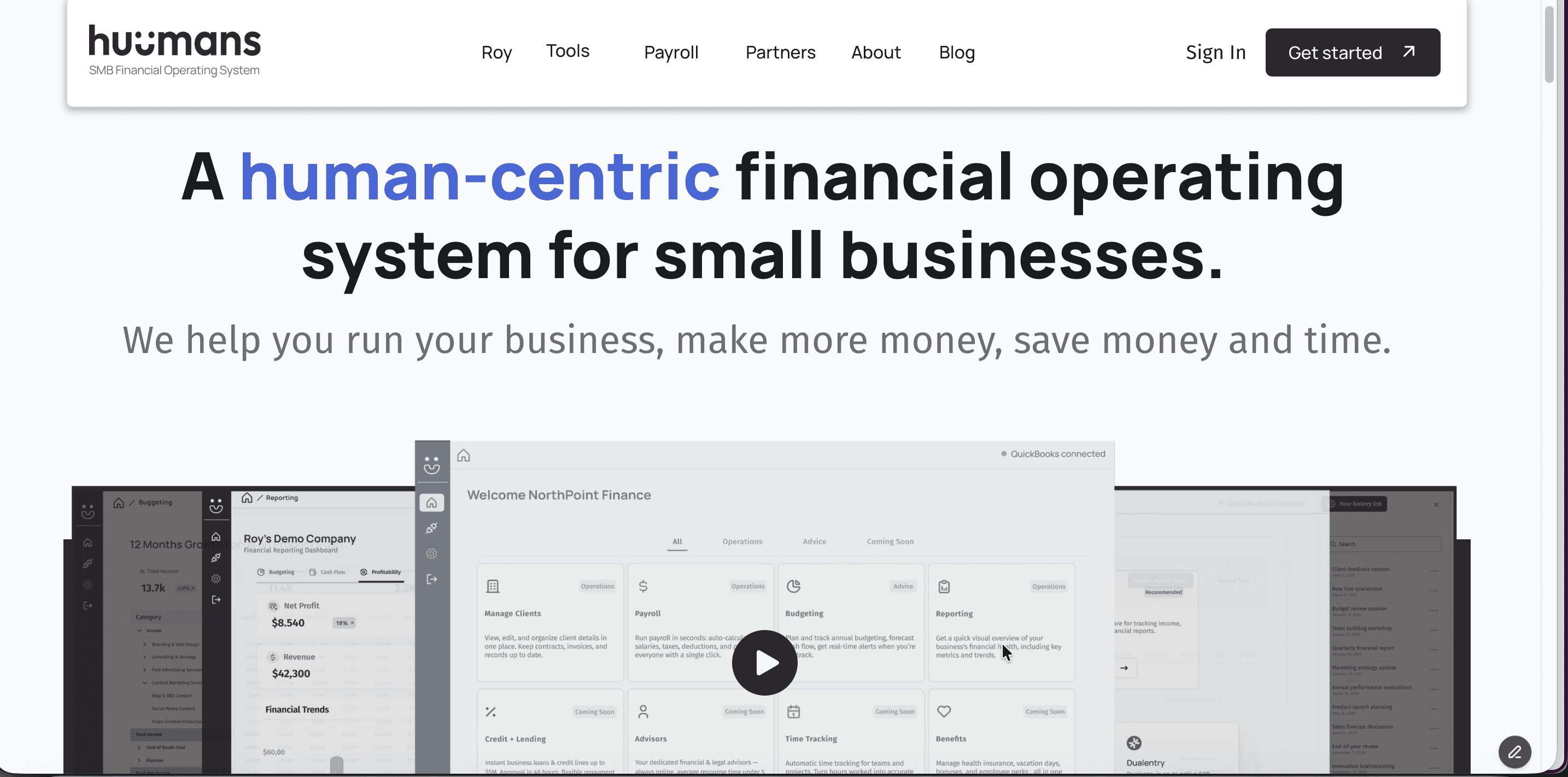
We’re pledging ourselves to clarity through a new, deliberately simplified look. A primary black-and-white colour palette — applied across our website, social media, and our small business tools — creating a sophisticated, uncluttered brand and user experience.
Essentialism is the new black… and white
There’s a practical side to choosing a colour scheme. Things like high-contrast designs that improve accessibility and visibility and the purposeful avoidance of visual noise that comes from a disjointed approach. Then there’s the emotional side where all feelings and intangibles come into play.
“We’ve been very intentional with this redesign. There’s already enough noise in the small business space. Huumans wants to be laser-focused on delivering clarity. We want you to see and feel this in everything we do.”
—Maher Jaber, CEO, Huumans
Research shows that people form their first impression of a product or brand within 90 seconds — and colour represents 90% of this decision-making process.
In life and business, there are times when things are complete opposites, like when income flows in and expenses are taken out. But there are also complements, like using a budget to set goals and cash flow to measure how and when financial resources come into and out of your business.
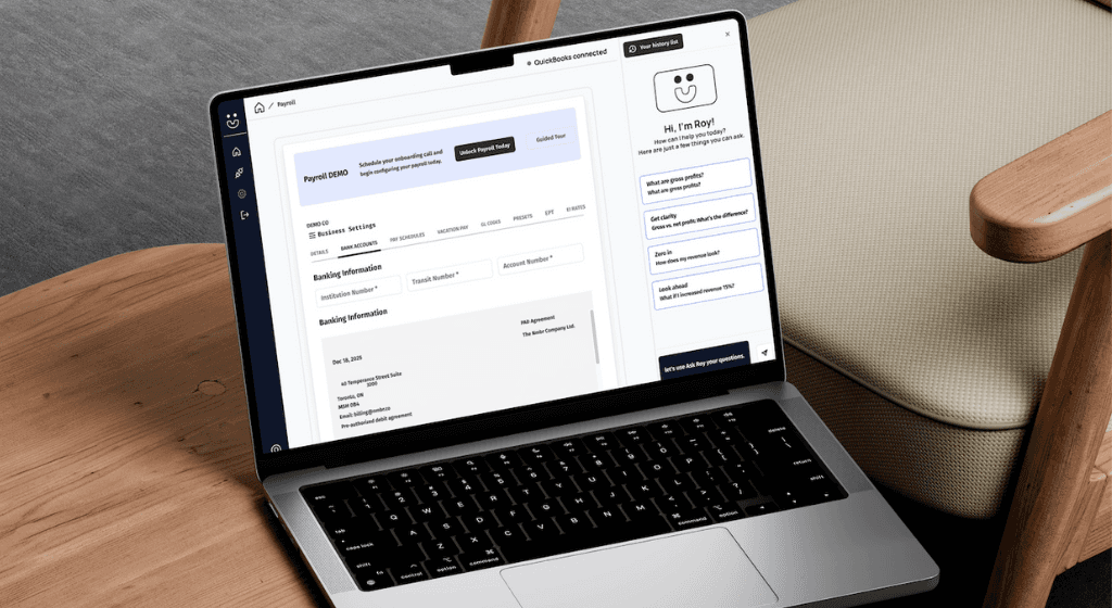
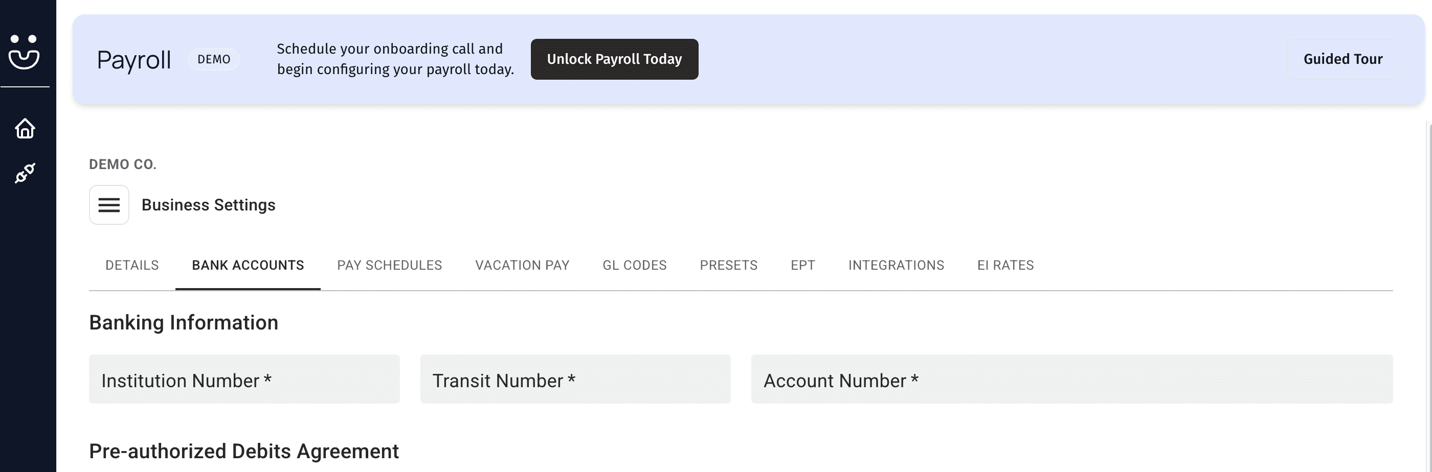
Our new design system helps Huumans be more intuitive, so you can get the frictionless, distraction-free resources and clarity you need
Do we detect an accent?
With black and white as our branding foundations, we can also apply natural highlights as needed. Shades and hues of blue add a pop of colour and call attention to key details, success messages are celebrated in greens, and reds caution you when errors occur.
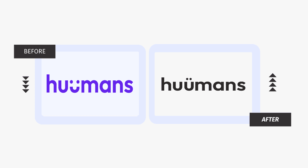
Putting the U back in Huumans… literally
Leaving no detail unturned, we even refined our logo. Although we spell our name with a double U on purpose, our design we had wasn’t as measured. Inadvertently, people were uncertain if our second U was a functional letter or just a smiley face. We found a solution that solved for both, making our name and our humanity abundantly clear.
Form meets function and more features
We’re not just building a one-of-a-kind brand and user experience, we’re also giving you the tools you need to build success for your small business. This year, in addition to continually improving our hub, Roy, payroll, reporting, and budgeting, we’re also going to add an accounting partner directory, lending, and more.
See it all for yourself. Sign up for free and follow us on LinkedIn, Instagram, Facebook, and YouTube for updates.